Logo ideas · Beauty & wellness
Lash Studio Logo Ideas
A lash studio logo spends most of its time on mirror stickers, window vinyl, appointment cards, and that tiny round Instagram avatar, so it needs to read clearly at any size. The best logos use shapes that suggest lashes or brows without literal illustrations, and stay crisp even when foiled or printed small.
Make your lash studio logo →Free to try: enter your business name and see original concepts. Pay only if you download.
9 lash studio logo examples
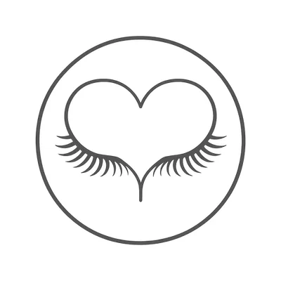
Designed by Markhush for two example businesses: Feathered Lane, soft, laid-back studio specializing in natural-look lashes and brow shaping, and LashCraft Studio, modern, high-contrast lounge for bold volume lashes and brow sculpting. Yours would be designed around your own name.
Colors for a lash studio logo
- Matte Black #18191BMatte black decals look luxurious and stay readable against mirrors, glass, and most interior walls.
- Champagne Gold #D6BA8BChampagne gold foil prints sharply on appointment cards and looks premium on metallic vinyl for mirrors.
- Cloud White #F4F3EFA soft white stands out on window glass and pairs well with dark salon backgrounds, without looking harsh.
- Dusty Plum #98788FDusty plum adds a subtle, modern color that photographs well with the neutral tones of studio interiors.
Symbol ideas
- Single curved line forming both a lash and brow. Merges the two main services into one recognisable mark that scales perfectly to stickers and avatars.
- Mascara wand shaped into the first letter. Instantly shows the service, and the wand’s bristles stay legible even at business card size.
- Eyelid silhouette with negative space lashes. Negative space keeps it clean for foil and vinyl, and the shape is unique on social profiles.
- Closed eye with brow forming a semicircle. Easy to reduce to one color for mirror decals and quick to recognize for walk-by window shoppers.
- Thread spool unwinding into a lash curve. Hints at both threading and lashes, and the simple line art doesn’t blur when very small.
What to avoid
- Using a full eye with lots of detail: it looks cluttered and loses definition on mirrors or at small sizes.
- Thin script fonts for the business name: these break up when foiled or printed on glass and don't read on appointment cards.
- Literal photographs of eyes or lashes: they print poorly, look generic, and often come across as dated on signage.
Fonts
Go for modern sans-serifs with clean lines, like Montserrat or Quicksand for a crisp, readable look, or a bold serif like Playfair Display for a softer feel. Make sure the name is legible at 2 cm tall, since it needs to work on appointment cards and as a window decal.
Get a lash studio logo made for your name
Type your business name and Markhush designs original logo concepts for it. Pick the one you like, choose your colors, and download your logo with matching social media images, a business card and an email signature.
From $7.99 USD for one platform, or $49.99 for the full bundle. One-time payment, no subscription.
Start my lash studio logo →Lash Studio logo FAQ
Will my logo look good as a mirror decal?
Simple, bold designs work best—avoid thin lines and fussy details. Matte or metallic vinyl in black or gold will keep the logo visible in the salon’s lighting and from across the room.
How can I make sure my logo works for Instagram?
Design with the round avatar in mind: use a central, easy-to-recognize icon with the business initials or a simple symbol. Skip long text—at that size, only the main shape reads clearly.
What’s the best way to use color in my lash studio logo?
Pick one main color that prints well on both white cards and glass, then test your logo in black, white, and that color. Avoid gradients, which don’t show up on vinyl or foil and often lose detail in small sizes.