Logo ideas · Health & fitness
Personal Trainer Logo Ideas
A personal trainer’s logo lives on gym shirts, Instagram avatars, water bottles, and app icons, so it has to be bold and legible even at small sizes. The best logos in this field hint at motion or progress and are easy to spot on activewear and digital screens.
Make your personal trainer logo →Free to try: enter your business name and see original concepts. Pay only if you download.
9 personal trainer logo examples
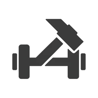
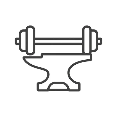
Designed by Markhush for two example businesses: ForgeFit, strength-focused coaching for busy professionals, in-person and online, and Pulse Motion, energetic, upbeat training for group classes and virtual fitness bootcamps. Yours would be designed around your own name.



Colors for a personal trainer logo
- Graphite Black #232426Hides sweat stains on workout shirts and still looks sharp when printed on dark gym bags or yoga mats.
- Neon Lime #B6FF47Pops on digital fitness dashboards and is highly visible on phone or smartwatch app icons.
- Steel Blue #537AA3Feels at home in urban gyms and photographs well against both light and dark athletic gear.
- Signal Red #F43F3BGrabs attention for calls-to-action on social media posts and gym signage, even in a cluttered environment.
Symbol ideas
- Kettlebell merged with a checkmark. Shows progress and fitness in one shape, remaining legible at small sizes on badges and icons.
- Dumbbell forming the crossbar of a capital 'T'. Makes the training focus clear and doubles as an initial for trainers whose brand starts with T.
- Pulse line morphing into a running shoe. Communicates energy and movement, reading clearly even on a small app icon or embroidered patch.
- Stopwatch integrated into the letter 'O'. Directly ties to session timing and personal milestones, and is easy to reproduce on digital or printed materials.
- Negative space silhouette of a plank pose inside a hexagon. Suggests strength and structure, and the geometric shape keeps it recognizable on social media or water bottles.
What to avoid
- Crowding the logo with equipment icons (weights, shoes, jump ropes all at once): it clutters the mark and loses impact on small digital uses.
- Super thin or overly stylized script fonts: these become unreadable on gym shirts or when scaled down for mobile screens.
- Literal photos or clip art of flexing bodies: not only do they look generic, but they can also intimidate beginners browsing your site.
Fonts
Go for bold, geometric sans-serifs (like Montserrat or Raleway) for the main name, paired with a lighter sans (like Open Sans) for secondary info. Always test the logo at 2 cm wide and in white on a black background, since it’s common on gym gear and profile images.
Get a personal trainer logo made for your name
Type your business name and Markhush designs original logo concepts for it. Pick the one you like, choose your colors, and download your logo with matching social media images, a business card and an email signature.
From $7.99 USD for one platform, or $49.99 for the full bundle. One-time payment, no subscription.
Start my personal trainer logo →Personal Trainer logo FAQ
Should my logo include gym equipment?
Only if it’s integrated cleverly or simplified, like a dumbbell forming a letter. Too many details or generic icons make the mark blend in and look busy, especially on social media avatars or merch.
How many colors should my logo have?
Stick to one or two main colors that contrast well, so your logo stays punchy on shirts, digital screens, and water bottles. Make sure it also looks good in black and white for invoices and paperwork.
Can I use a script or handwritten font for a fitness logo?
It’s risky—most script fonts disappear on the back of a T-shirt or as a small screen icon. Stick with bold, clean typefaces that stay readable even when your logo is just a few centimeters wide.